Among screens users navigate to on their own, Payment History has the highest page views in Naver Pay. Seeing it as more than a simple record lookup — as the space that shapes the entire post-payment experience — we redesigned its list structure.

Npay: Payment History
2022
Role
Design/UX PL — proposed the project, pitched the concept, directed the design
Outcome
Engagement (clicks per PV) +20% · double-digit increase in routed payment amount
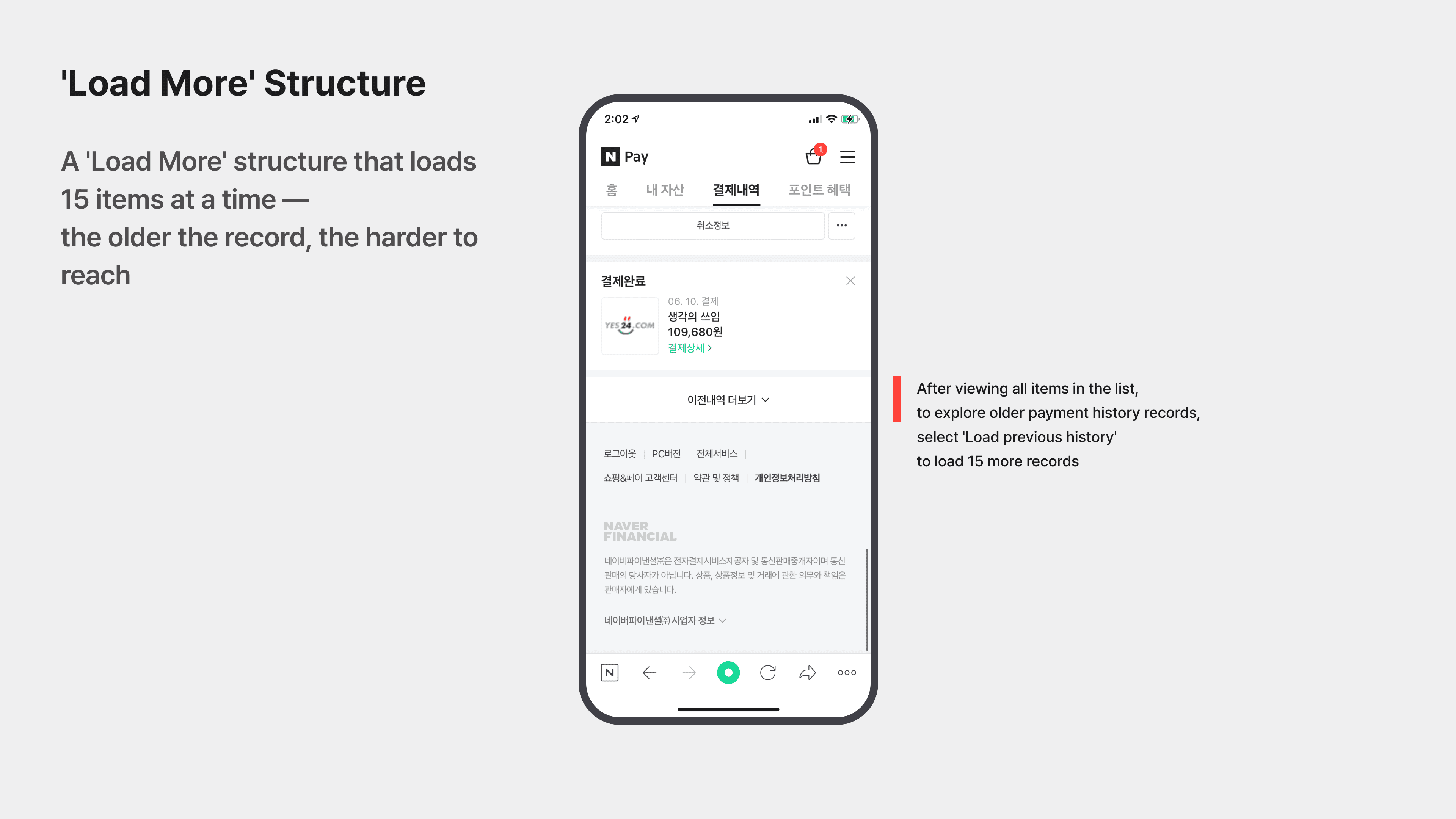
From “Load More” to Paging
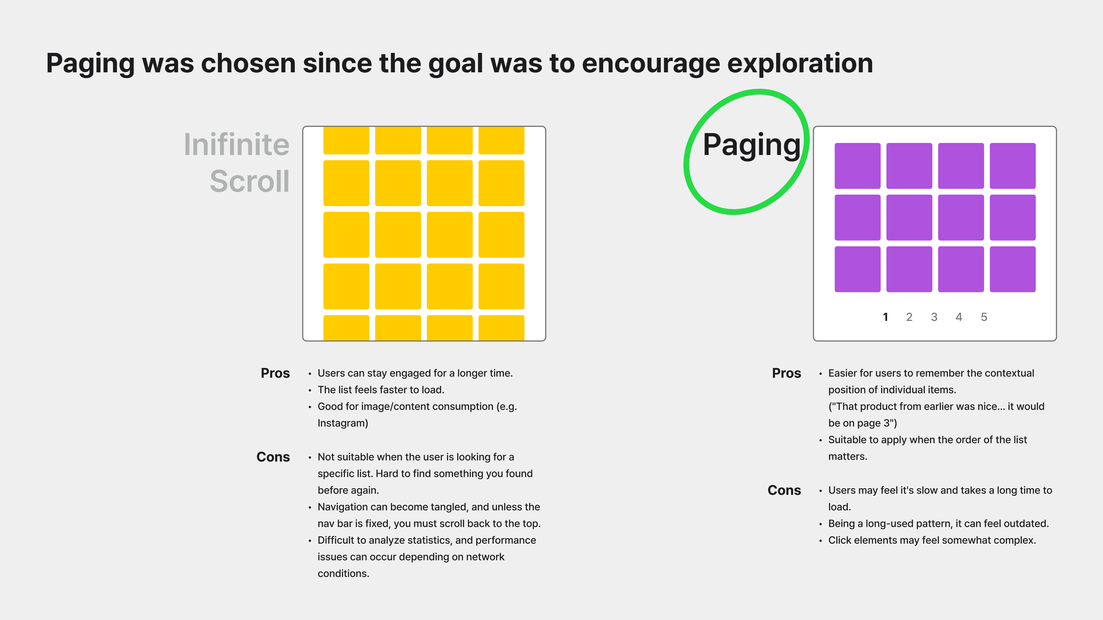
The old “Load More” pattern made it hard to find items purchased long ago, and after loading the list several times, users lost track of where they were. To support the goal of encouraging further exploration, we chose paging over infinite scroll.
Bundled Card Structure
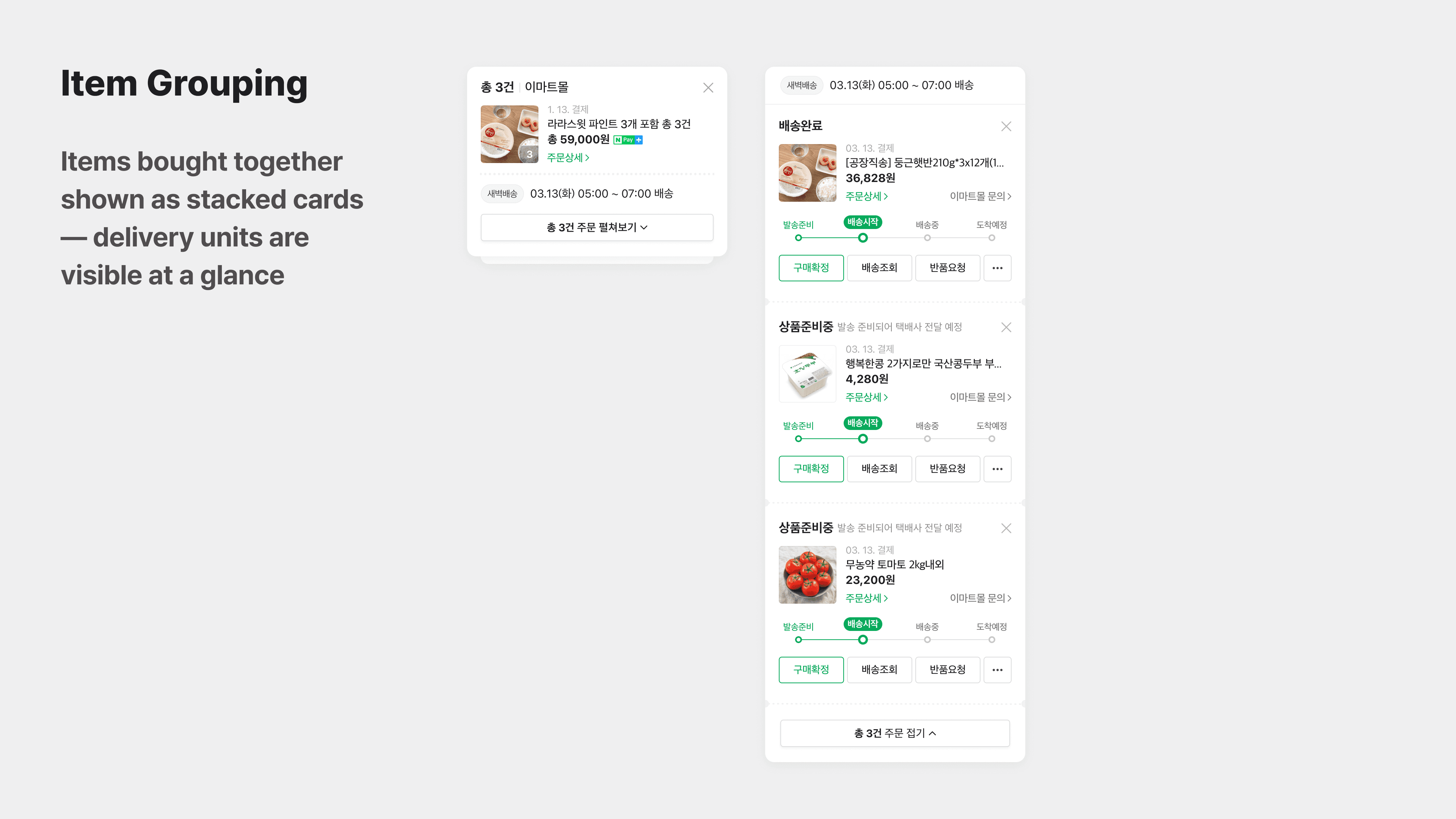
Items ordered together were previously scattered across separate entries, wasting space, and repeated shipping info made it look like they were shipped separately. We converted entries into cards and grouped items bought together using a stacked-card metaphor, letting users browse more history on a single screen.
Results and Outcomes
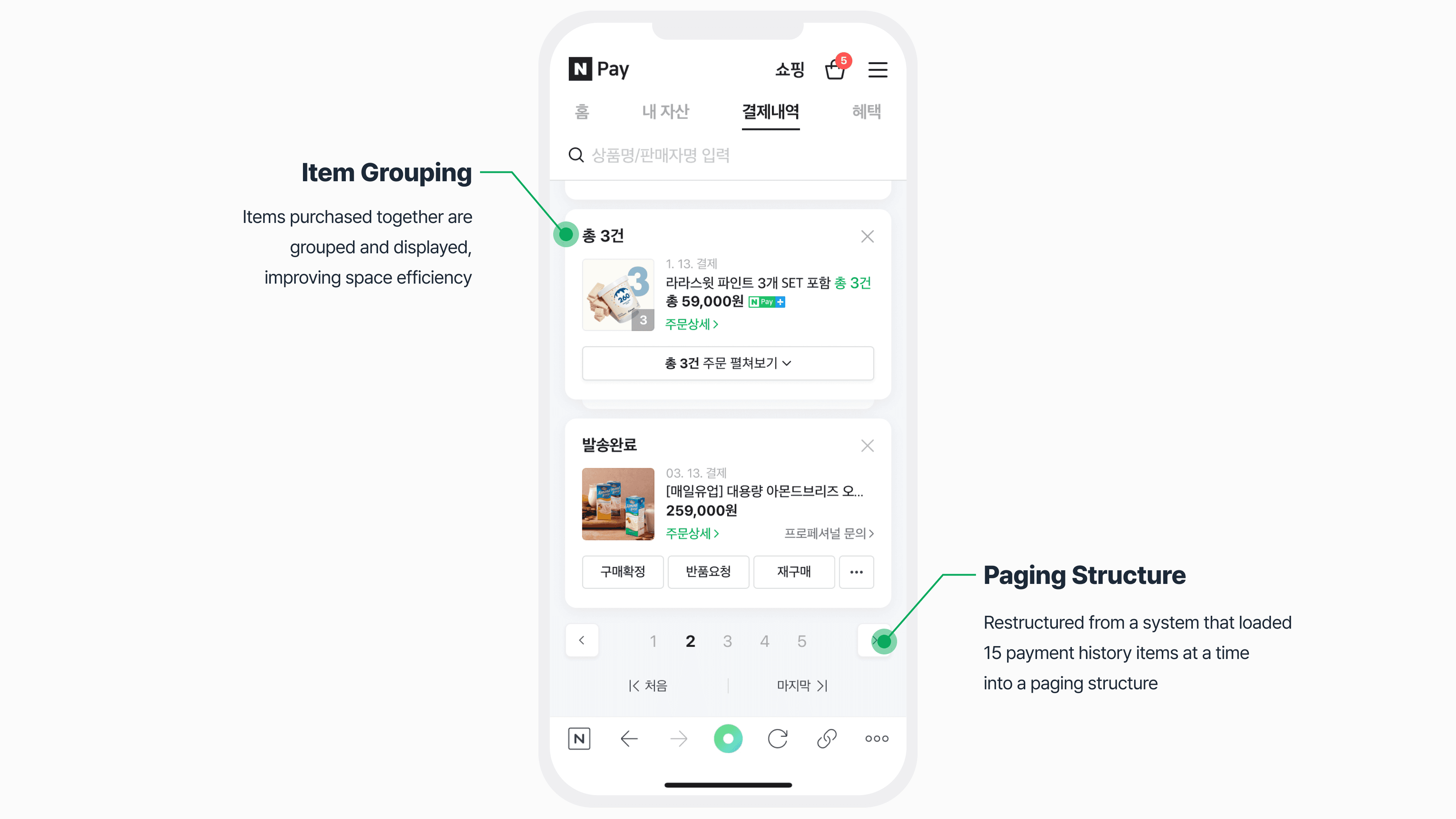
After shipping this alongside search/filter improvements and default category adjustments,
Smart Store payment amounts routed through Payment History rose more than 10%, and click events per page view increased by about 20%.