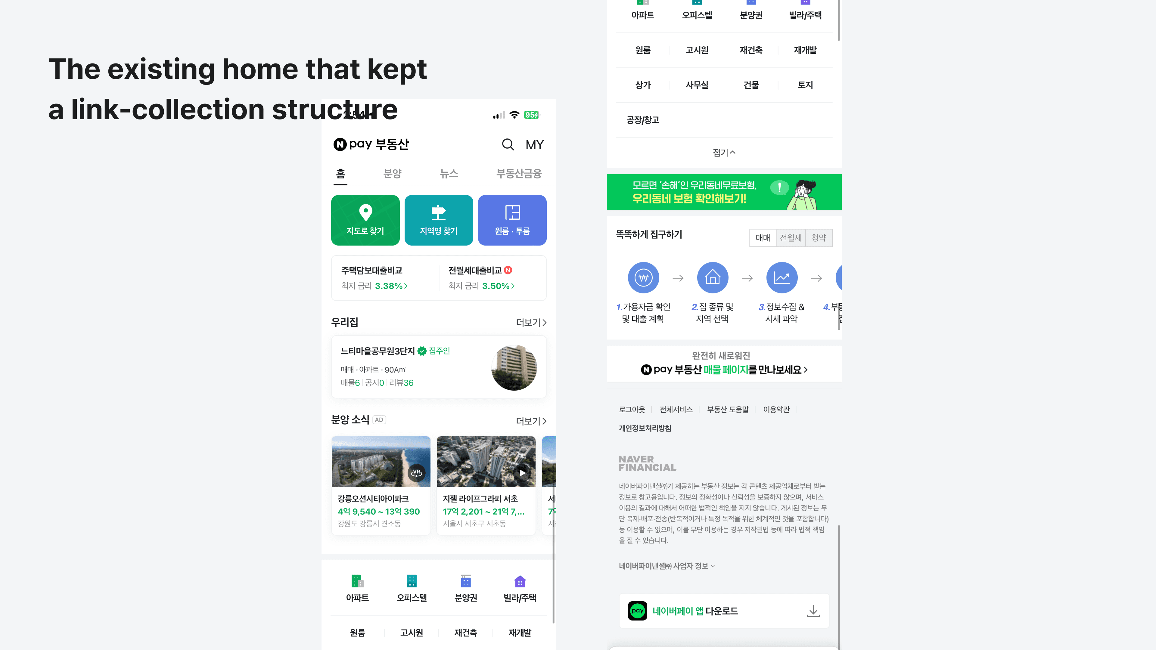
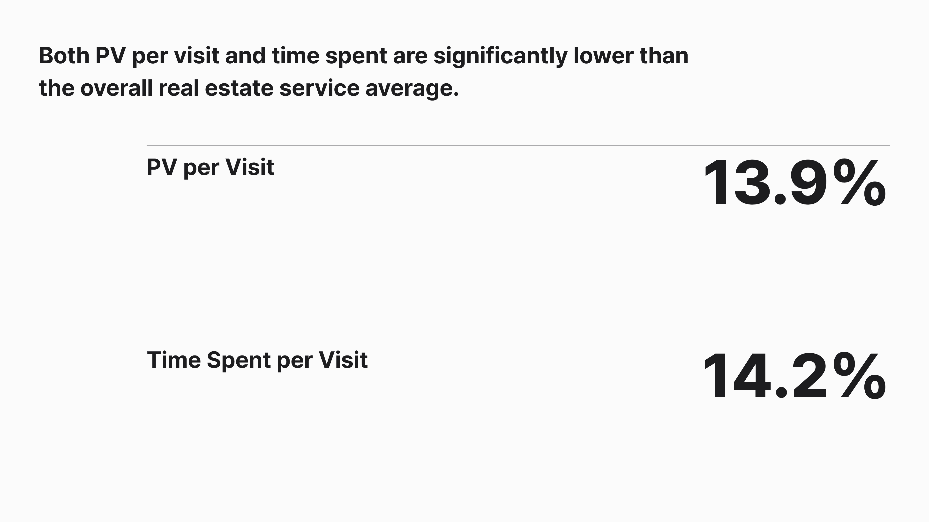
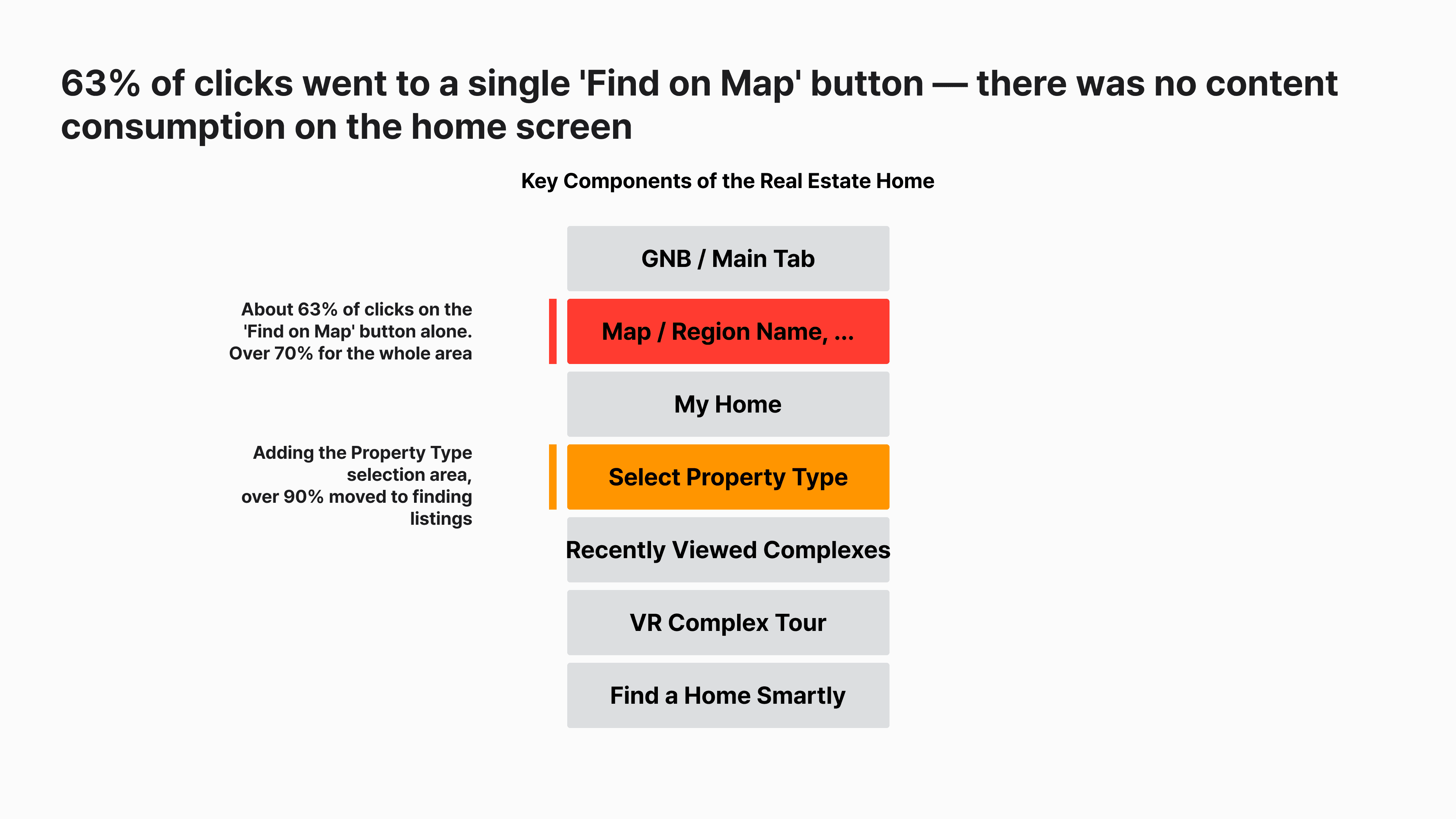
Naver Pay Real Estate's mobile Home was essentially a collection of links. Over 90% of clicks were just to navigate to Find Listings, and both PV per visit and time spent fell well below the service average — Home was little more than a place people passed through.

Npay: Real Estate - Mobile Home
2024
Role
Design/UX PL — set the redesign direction, coordinated stakeholders, defined detailed specs
Through a workshop involving product, design, and engineering, together with metric analysis, we redefined Home's role.
“A space centered on me and my interests, that broadens my view of real estate.”
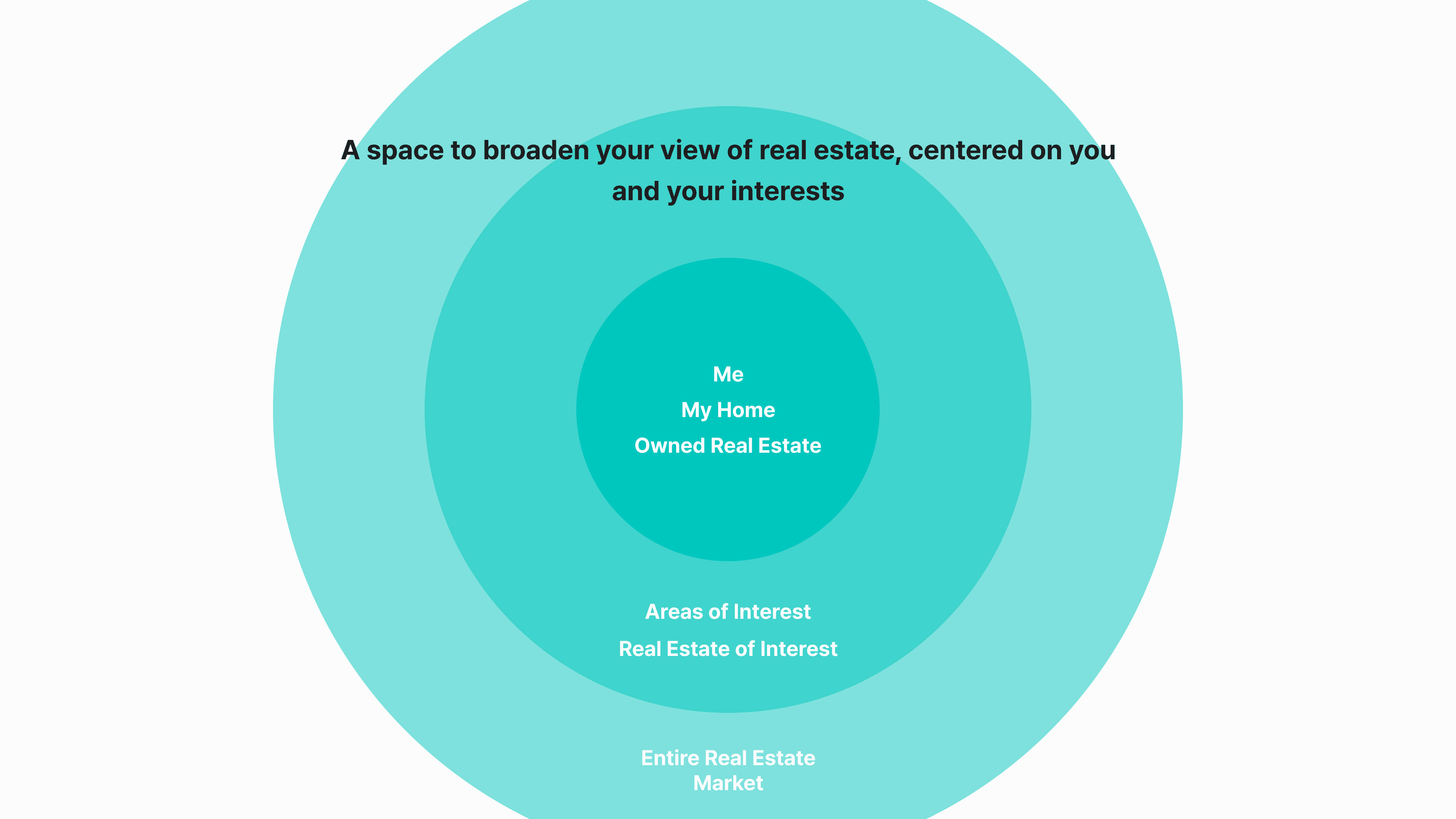
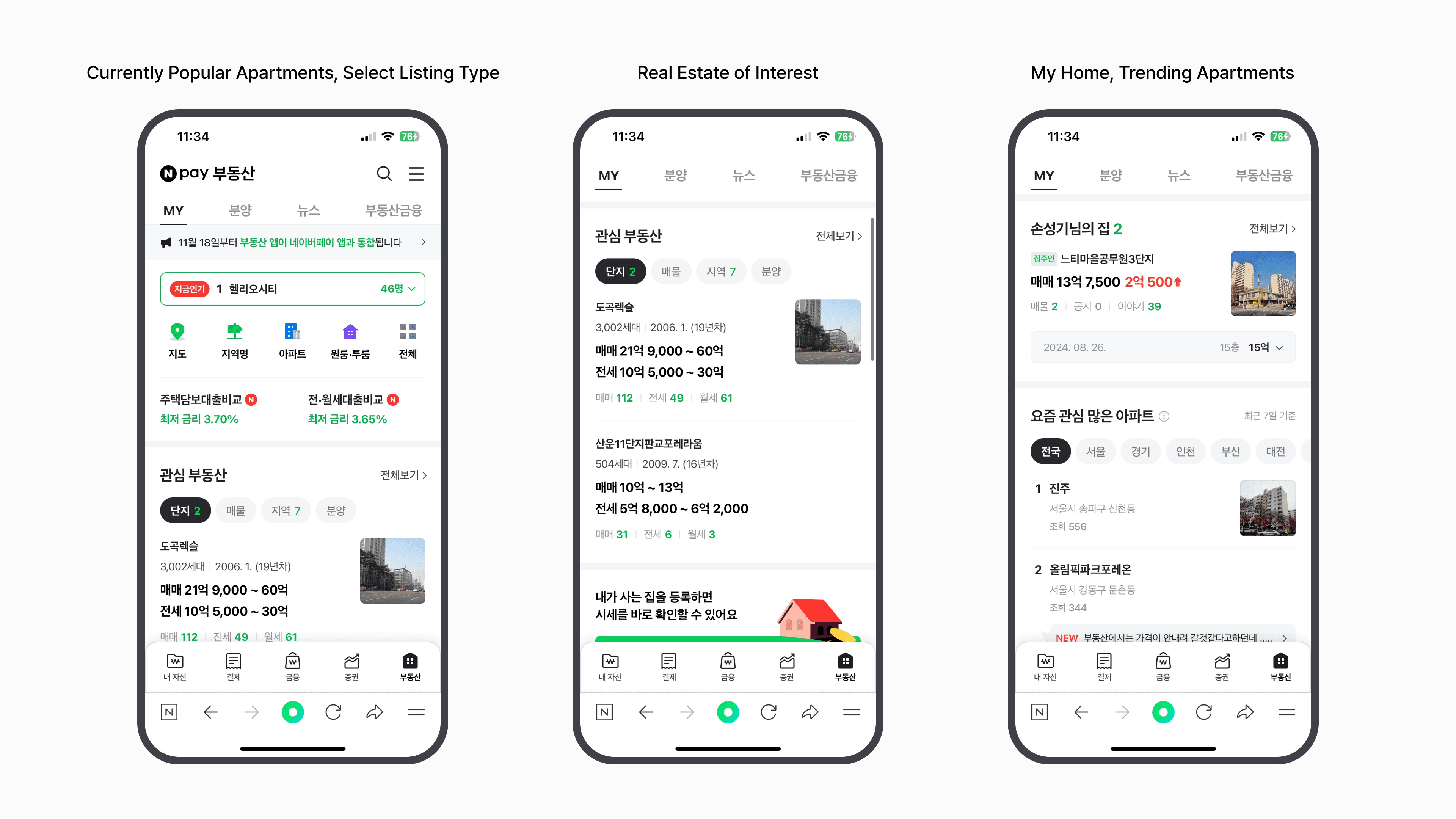
The direction centers on “My Home” and saved listings — what users care about most — while adding ways to take in broader market trends.
Final Design
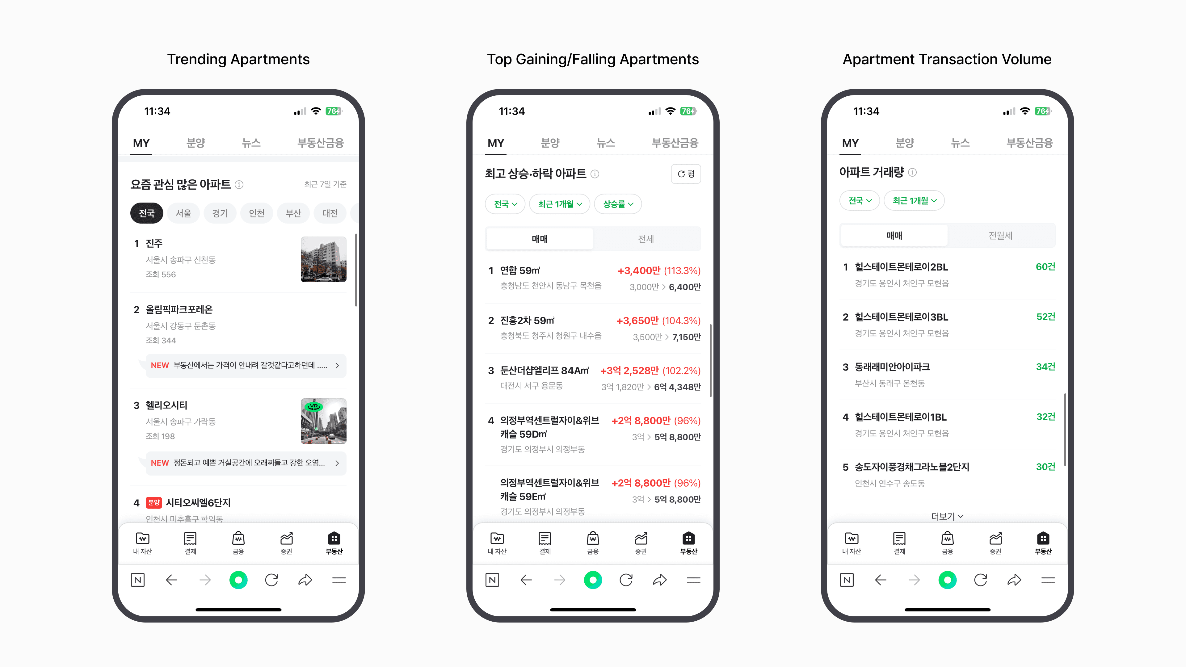
The page opens with a real-time ranking of trending complexes/areas, followed by the most-used Find Listings entry point. From there it flows into saved listings, My Home, ranking content that surveys the market, listing recommendations, and VR tours.
Saved Listings Redesign
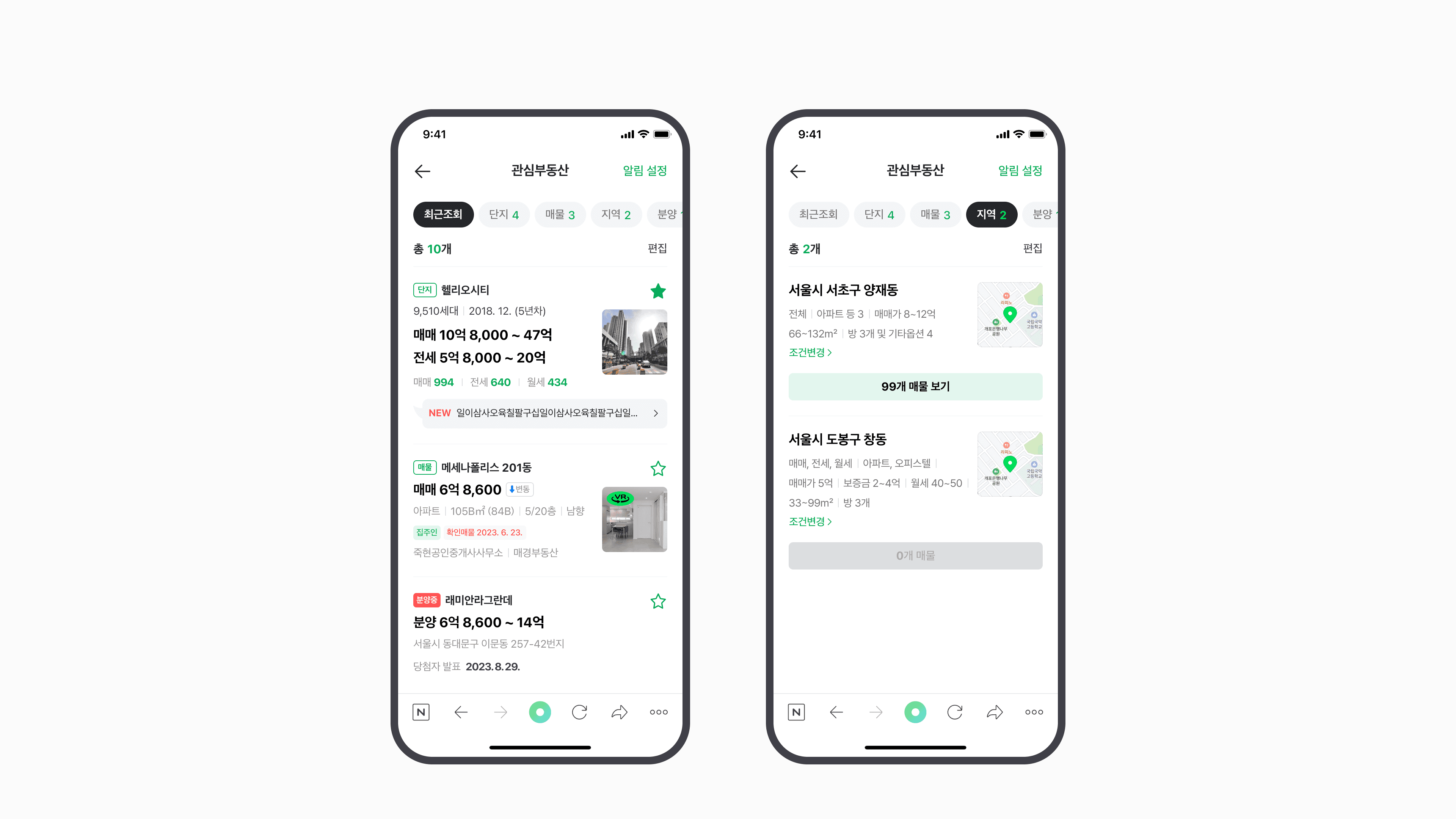
We also redesigned Saved Listings, the screen most closely tied to Home. We expanded Recently Viewed — previously limited to complexes — to include individual listings and pre-sale complexes, and made it possible to save areas of interest along with detailed filter values.
Limitations in Measuring Impact
After launch, the standalone Naver Pay Real Estate app was phased out, and a major service policy change required using the Naver Pay app or the Naver app instead — making it difficult to precisely track usage flow.
That said, Naver Pay app users grew substantially over a short period afterward, and real estate usage metrics improved significantly as well — I believe this redesign made a positive contribution.