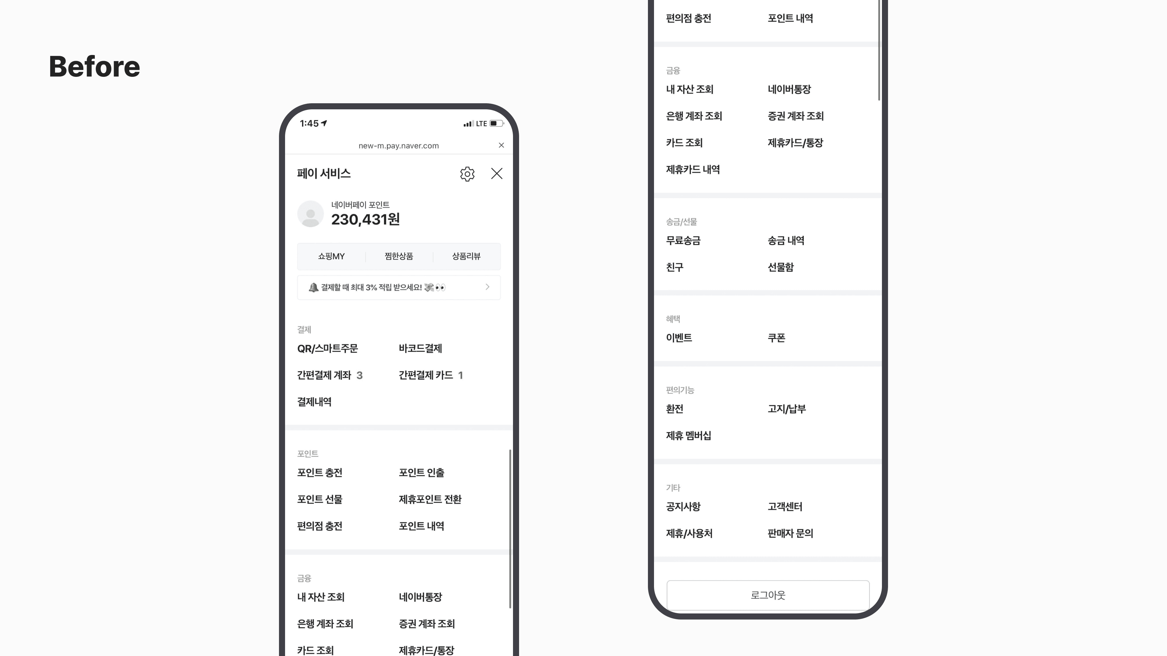
This was during the period when Naver Pay was expanding beyond payments into financial services. The Full Menu screen, which housed a rapidly growing list of services, failed to surface new menu items, and uneven group sizes made it harder to navigate.

Npay: Full Menu
2021
Role
Designer — organized ideas, visualized concepts, defined detailed specs, presented decisions
Click Metrics Analysis
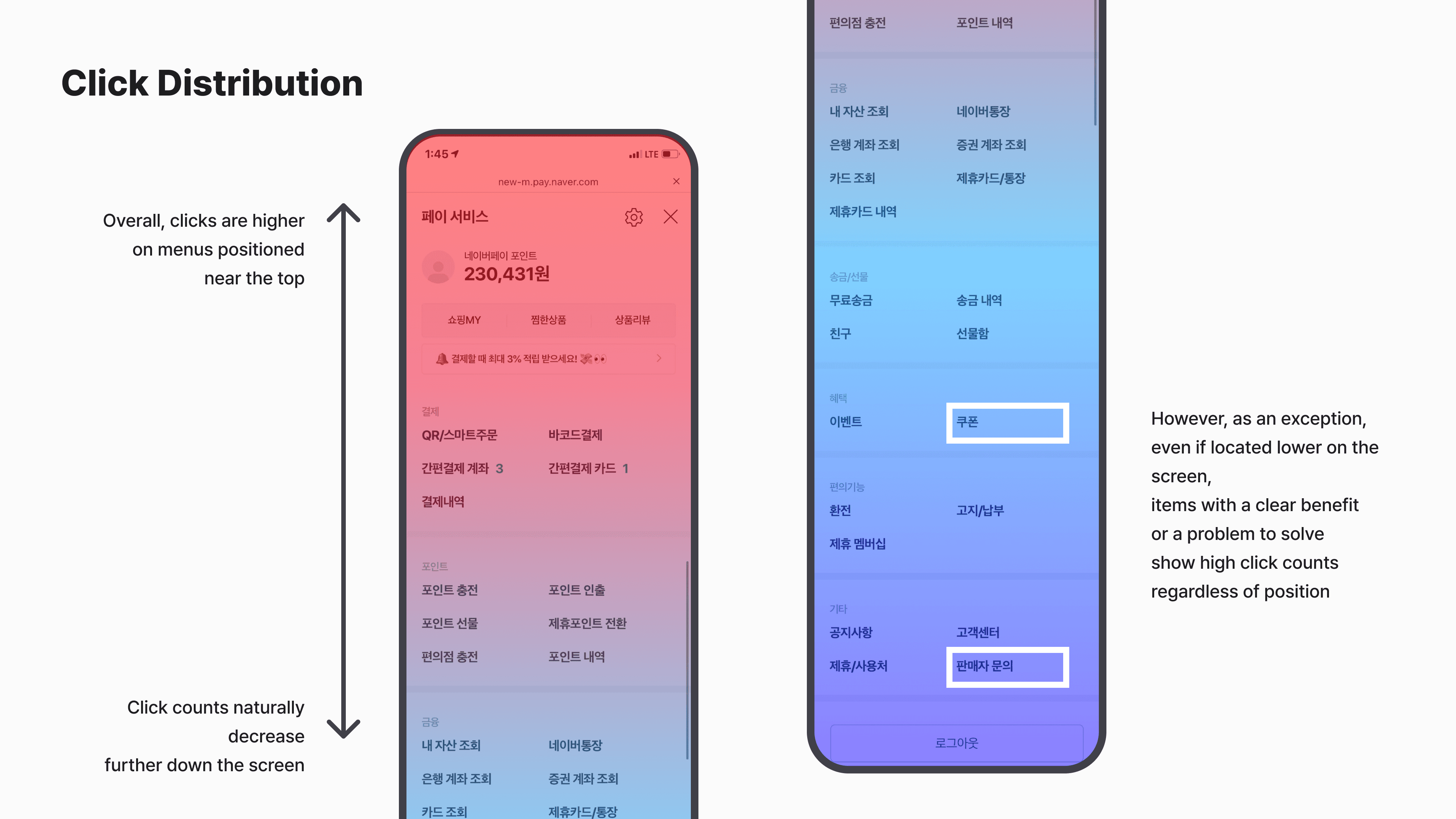
Click metrics revealed three things: active movement between Shopping and Pay through the menu, a sharp drop in clicks further down the screen, and higher usage for menu items offering benefits (coupons) or urgent needs (seller inquiries). From this, we derived six questions — “can we reduce browsing time?”, “can new menu items be discovered easily?”, and others — as requirements.
Requirements
Based on these issues and findings, and after intense internal discussion, we arrived at six questions — and the requirements that followed.
How can we further strengthen the connection with Shopping?
Is there a way to reduce menu browsing time?
Can users easily notice when a menu item is new or updated?
Is guidance about linked services sufficient?
Is the current menu composition and ordering appropriate?
Are the menu labels easy to understand?
Final Design
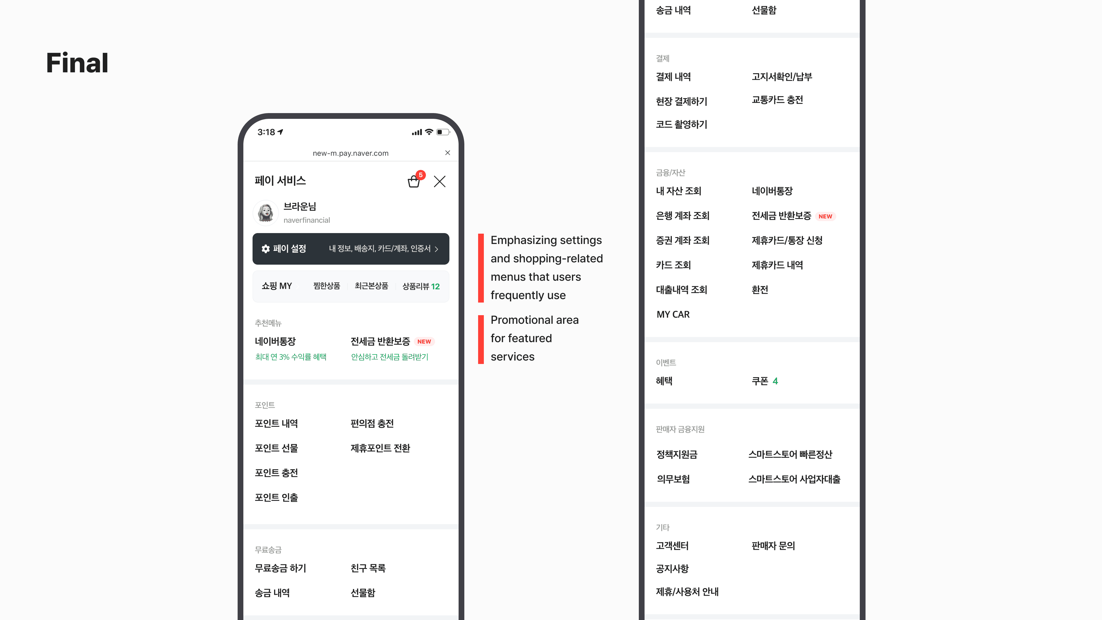
We kept the existing two-column framework but adjusted the design so priority menu items stood out.
We removed the points balance display (already visible before entry) and duplicate menu items. The biggest change was the display order — restructuring from a “Payment”-group-first layout to one led by “Points,” Naver Pay's strongest differentiator.